Dozen Investments
New brand and new digital product

Venture capital online
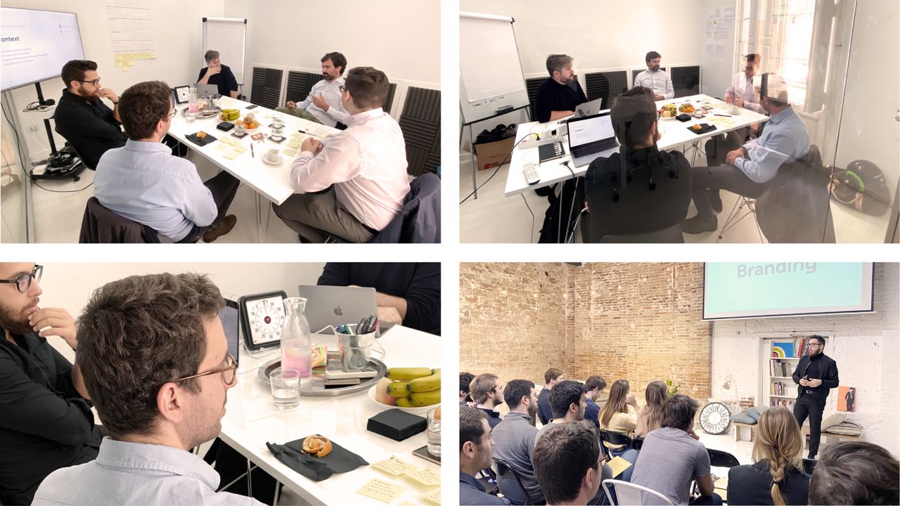
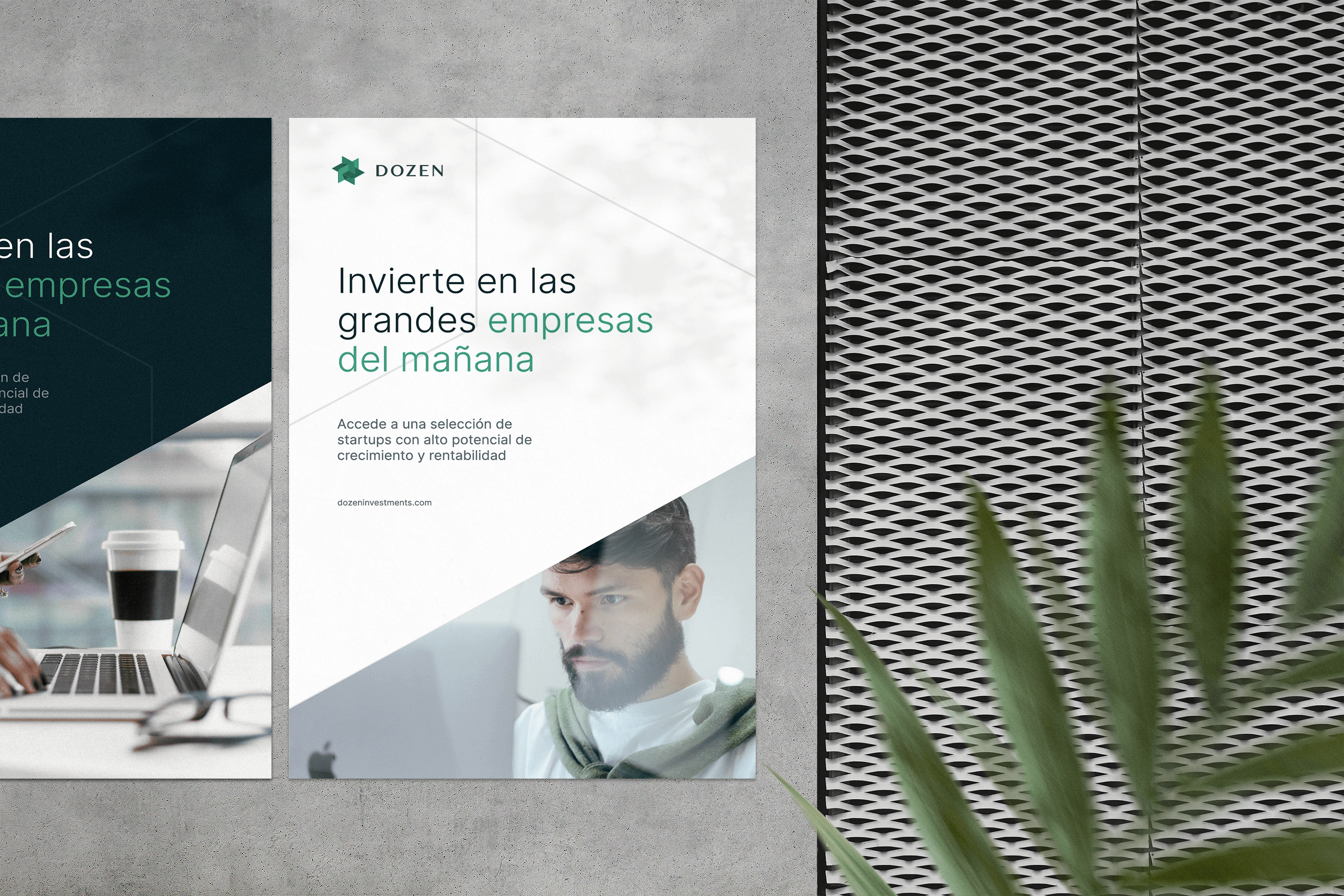
Dozen is deservedly known as the reference in online venture capital funds in Spain. A platform where you can invest in innovative and relevant businesses from just €3,000. After eight years of activity as The Crowd Angel, they asked us for help to reposition their brand where it belonged, giving rise to a project of brand strategy, naming, brand identity, website design, and development of their digital product.
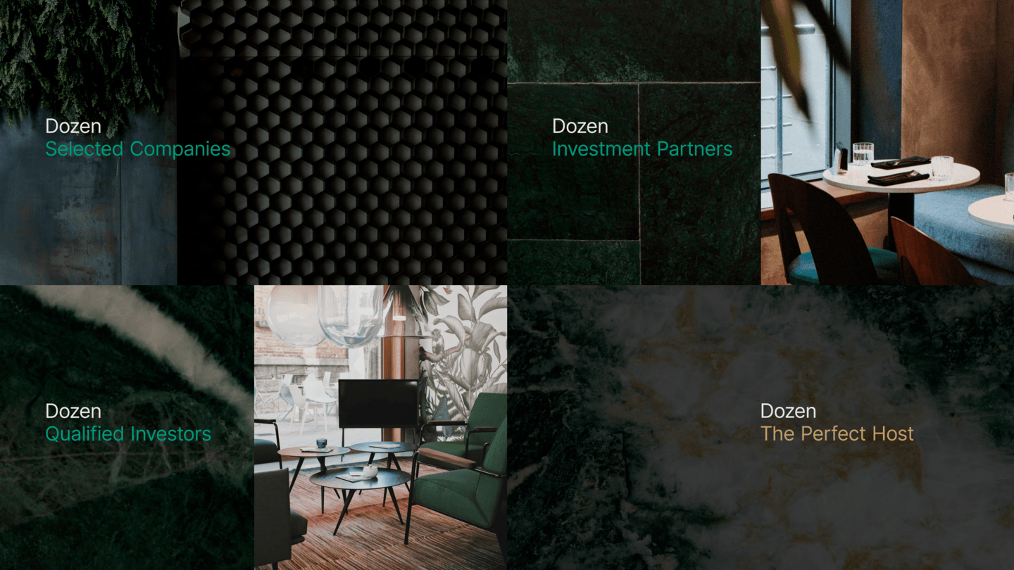
The perfect host
The entire strategy is articulated by the concept of the Perfect Host. The reality is that the concern, involvement, and attention of the entire Dozen team is akin to that of a perfect host: selecting guests, connecting and accompanying them, and ensuring that everything is perfect.
A group of twelve
Twelve is the solar number par excellence, a symbol of order and perfection, charged with symbology, especially in Mediterranean culture, where it speaks of harmony and purity. On numerous occasions, it represents a relevant and select group of people, with the ability to make change. A complete, balanced, perfect structure.
Perfection - also in the visual
Platonic solids or 'perfect solids’ are polyhedra formed by regular polygons that are identical to each other. Specifically, the dodecahedron is made up of twelve equal regular pentagons, and houses a curious secret inside: the symbol of Dozen.
The dodecahedron encloses the intersection of three rectangles of golden proportions in such a way that each of the twelve vertices of the resulting figure coincides with the interior centre of each of the twelve pentagonal faces of the polyhedron.


Dozen creates an environment where everything fits and thrives, building unity and promoting meticulous attention to detail.
We work with a symbol-object, which can be built in three dimensions, and can be touched. We were somewhat surprised to observe how such a great attachment to this new element was born, and a feeling of belonging to the company was triggered simply by having its logo in our hands.

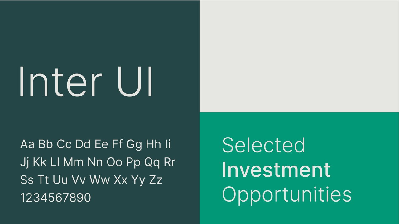
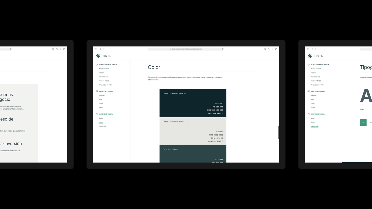
The entire visual system is born from the geometry of the symbol itself and from the imaginary of select environments, where the hosts are in charge of having the relevant people in attendance at all times, and ensuring that everything turns out perfectly.


ONLINE PRESENCE
We helped Dozen to share their value proposition on their website, and to update their product with everything that they had learned over the years. New navigation, flows, structure and patterns of use, brought to life with a new design system that is born from the new visual identity, and from that concept of the perfect host. In this case, we were also able to manage all the front-end programming, and updating the back-end to prepare it for the new stage.
RESULTS
We will be studying closely the new numbers that result from the new product and the new website, but we can already see the first benefits of facing a process like this: attachment, a feeling of belonging within the team. Renewed desire and energy, maximum alignment, and the certainty that goals that previously seemed to be distant dreams can be achieved.

SCImago
The challenge
Proyectar el valor real de SIR como herramienta de diagnóstico basada en evidencia y comunicar la apertura pública de sus 20 indicadores.
The solution
Evolución de la narrativa y la identidad visual del panteón, junto a una web optimizada para filtrar y consultar un alto volumen de datos.
Ucademy
The challenge
Supporting candidates through a long, demanding, and solitary process, providing focus and structure for a confusing and emotionally draining journey.
The solution
The Polaris brand: a true north with an understated identity, an orange palette, and clear language that cuts through the noise to guide steady progress.
Ucademy
The challenge
To tailor vocational training programs to connect with students looking to get unstuck and enter the job market, moving away from a purely academic approach.
The solution
The Explora brand: a physical and active identity with a triad of greens and action-oriented language that connects training to real-world application.
Ucademy
The challenge
To specialize the university admissions pathway to connect with young students who are pressured and disoriented by a complex system.
The solution
The Atlas brand: a roadmap with approachable language and a vibrant identity that streamlines the process to help the student hack their way.